The Castle Climbing Centre. London’s premier multi-use climbing centre and one of the best-known centres in the UK and Europe.
The project
9-month website redesign contract. Included in depth customer research, iterative prototyping, and creation of new brand assets and digital identity.
My role
Lead UX Designer / Researcher
This case study
This case study shines a light on my design thinking approach to solving one of the biggest problems in the indoor climbing industry – designing a system and interface that works for users of all (climbing) experience.
The problem to be solved
The business goal was clear – reduce barriers to entry.
Anecdotal feedback led the business to consider the existing website as a significant barrier. Largely due to excessive information and lack of cohesive structure.
Indoor rock climbing is inherently dangerous. As health and safety is paramount, there are various prerequisites to climbing at the centre. For a person new to the sport, it can be very confusing and daunting to know where and how to start.
For example, with reference to the existing site menu, one user pointed out: “I’m not sure if I should be pressing ‘Booking to climb’, ‘First visit’, or ‘Entry and prices’.” (see Fig 1).
What do new visitors need to do to climb at the centre?
Fig 1. Old menu options confuse users (press to enlarge)
Fig 2. Examples of two competitor site menus (press to enlarge)
No one is getting this right…
I started by reviewing the digital presence of several other UK-based climbing centres, along with some non-climbing businesses that operate in a similar way, such as leisure centres and outdoor activity centres (this would help me anticipate the expectations of customers that had no experience of climbing centres.
Of all the climbing centre websites I examined, none presented new customer options in an intuitive way for users with no existing climbing knowledge. Even the best-looking interfaces quickly presented uses with confusing terminology and complex decisions.
Who is the user?
I collaborated with the Castle Marketing Manager on creation of user personas to represent the key website user types, with input from customer-facing staff.
These personas would serve as guides throughout the development of the project (see Fig 3).
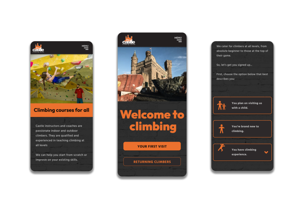
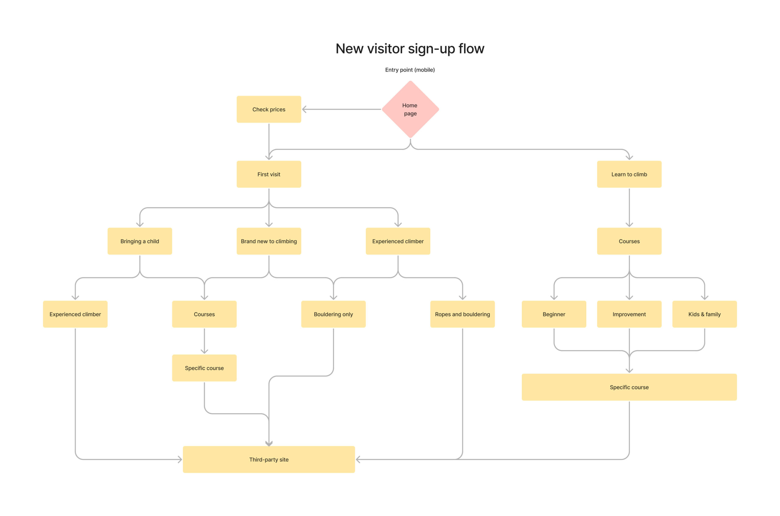
Ultimately, all new customers need to know what they need to do to start climbing at the centre. But their level of experience dictates the information they require as well as their expectations.
Simply presenting all permutations and expecting the user to read, process and decide what they want is failing the user.
The user needs a clear path to follow. One which does not rely on knowledge of jargon or present them with an off-putting amount of information.
1. Complete novice first timer
(our primary persona)
2. Non-climbing parent
(enquiring for a child)
3. Experienced climber
(never visited this centre before)
4. Regular centre visitor
Fig 3. User types.
Fig 4. Survey results suggested new visitors should be prioritised (press to enlarge).
Data-driven decisions
Survey results revealed that 96% of regular visitors to the centre claim to rarely or never look at the website. While this insight challenged long-standing assumptions within the business, it would inform my approach to design, providing a valuable baseline for content prioritisation and helping to refine our primary user. Ie. not the regular visitor.
Laying out all the pieces
Having identified our key users, I needed to consider how to balance their goals against the prerequisites of the centre.
I started by mocking-up potential user flows to ensure a smooth transition to the correct information/form. I conducted stakeholder workshops and feedback sessions to ensure team buy-in and to agree business goals were appropriately addressed.
Fig 5. User flow for new visitors (press to enlarge).
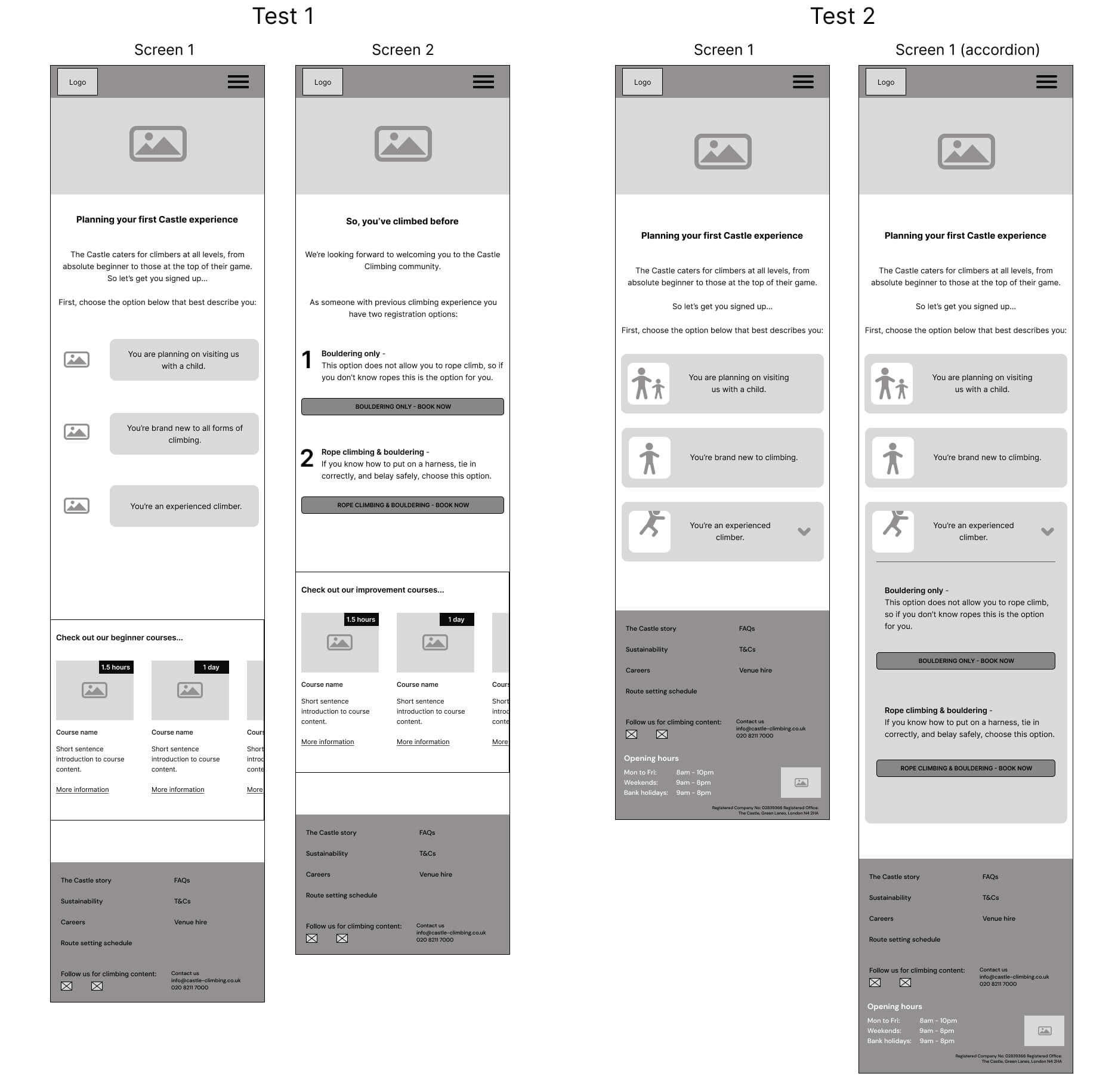
Fig 6. Example of improvement following user test. Test 2 does not require visiting a new page (press to enlarge).
Test, learn, iterate
Initially happy with my information architecture, I proceeded to test mid-fidelity prototypes. I tried different wordings and consequent user options, testing and changing on each iteration.
For example, I was interested to discover some customers with little or no climbing experience were engaging with the option intended for experienced climbers. When they realised their mistake, they needed to navigate back. So, I tested an accordion solution that resulted in an improved experience for both non-experienced and experienced climbers (see Fig 6).
Results
The new website is due to go live in December 2023. However, my final round of user testing showed a 70% reduction in time taken for a user to access the correct sign-up form for their circumstance (versus the old website). Preference testing also showed an excellent response to the visual design with user comments such as “…feels more adventurous”, “looks professional”, “easier to read information”, “really pops”.
In addition to providing a straight-forward and welcoming experience for users, the new system has the potential to dramatically reduce the queue congestion at reception as more customers will arrive better informed.
Fig 7. Options for first time visitors (press to enlarge).
Fig 8. Final design examples: Courses page and home page snapshots (press to enlarge).
Learnings
In order to solve this problem for both the user and the business, I needed a deep understanding of the centre’s policies and product structure. When research showed a disconnect between user understanding and business communication, I needed to work collaboratively, across multiple departments, to inform a solution. The reliance on industry-standard language needed to be challenged in order to bring indoor climbing into modern (customer focused) times.