User research (surveying and in-person interviewing)
Mapping user journeys and flows
Information architecture
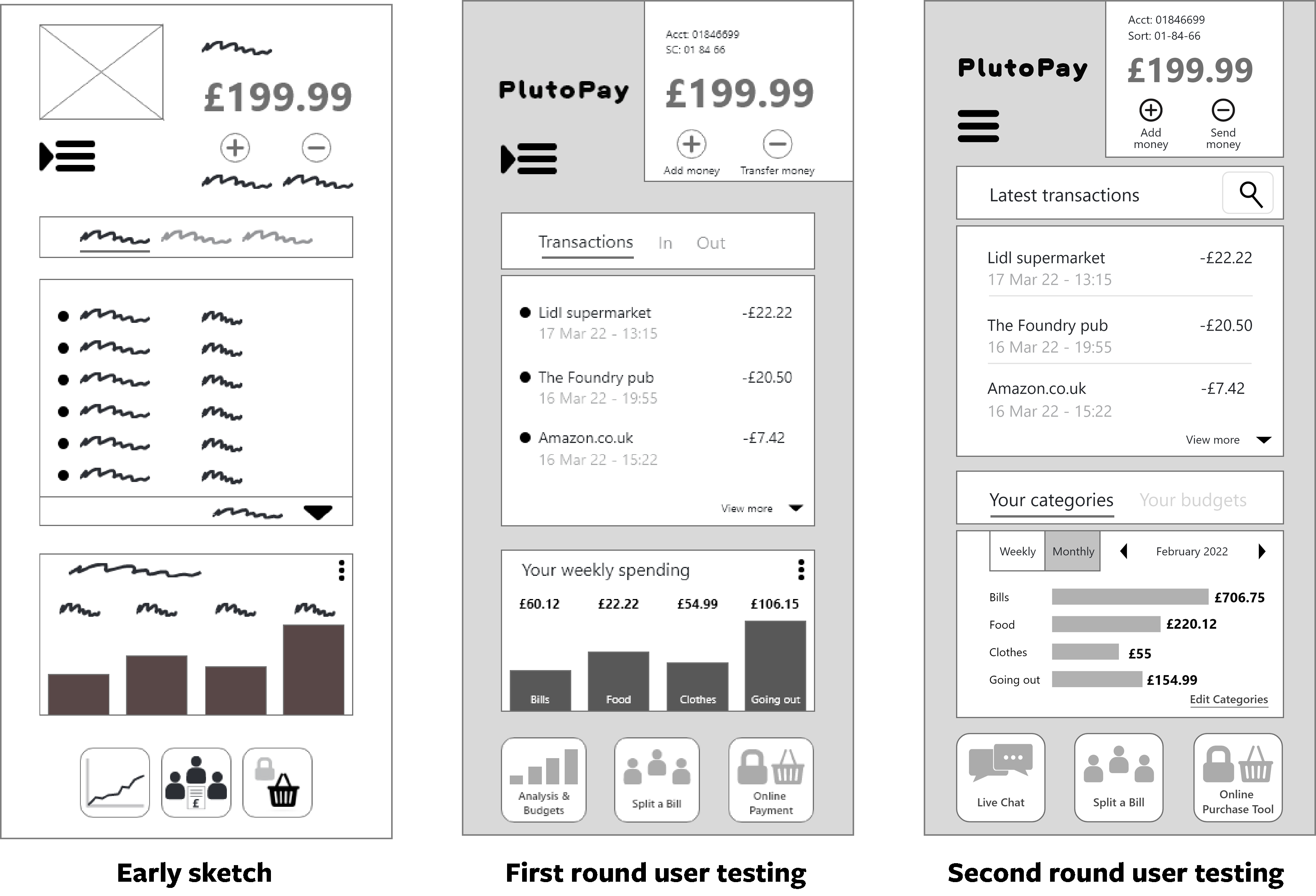
Wireframing
Prototyping
User testing (remote moderated and in-person moderated)
Result analysis and reflection
Design language system documentation
Objective
Take an initial business idea along with some prerequisite features and create a solution that allows anyone to shop, transfer money, and more without a debit or credit card or the need to visit a physical bank or store.
This case study gives an overview of my process and explores the steps I took to solve my problem statement.
So, where to start?
Before I began any formal research, I made a list of potential problems
users might encounter. I then suggested possible solutions for each. After considering these issues, I devised a problem statement to help structure my research.
Problem statement
People don’t always have their card to hand, and finding it a crucial point in the sales process can cause them to give up.
Understand the competition
I conducted detailed competitor analysis on the most significant businesses currently solving my problem statement for customers. I indentified these to be PayPal and Monzo.
Competitor analysis consisted of SWOT profile, key objective identification, market advantage, and marketing profile.
I then examined the competitor app usability, layout, navigation structure, compatability, differentiation, and calls to action.
To gauge whether the potential problems I had anticipated were issues for people, I composed and circulated a survey, and conducted interviews with current digital finance app users.
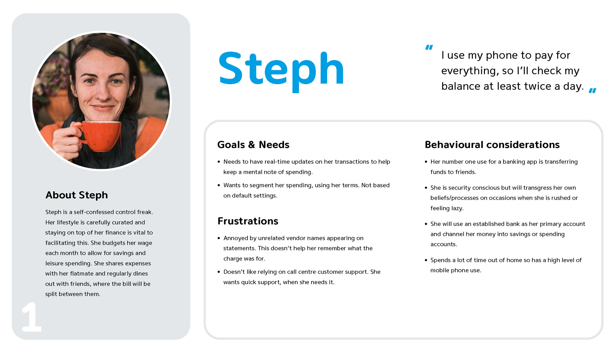
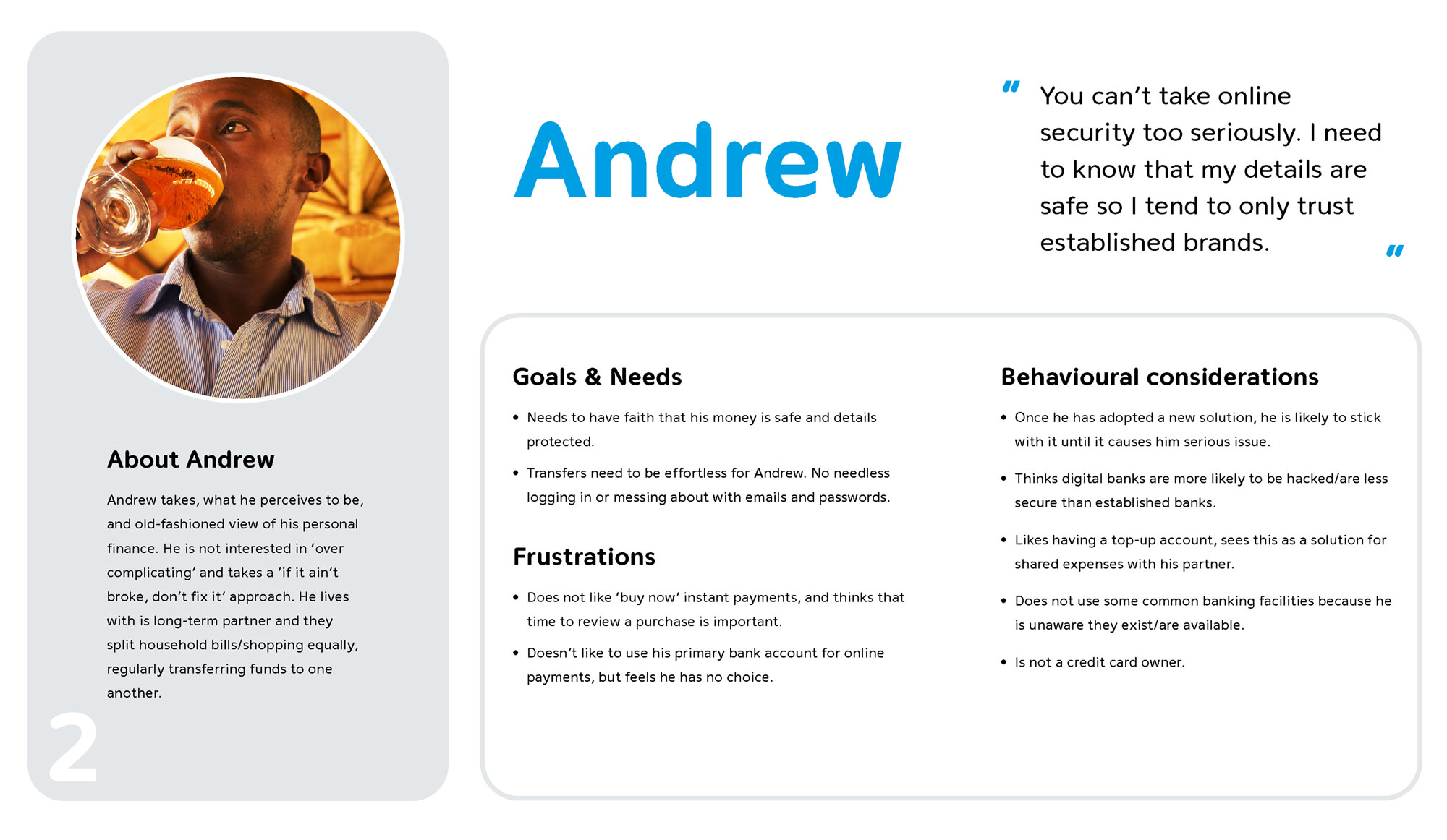
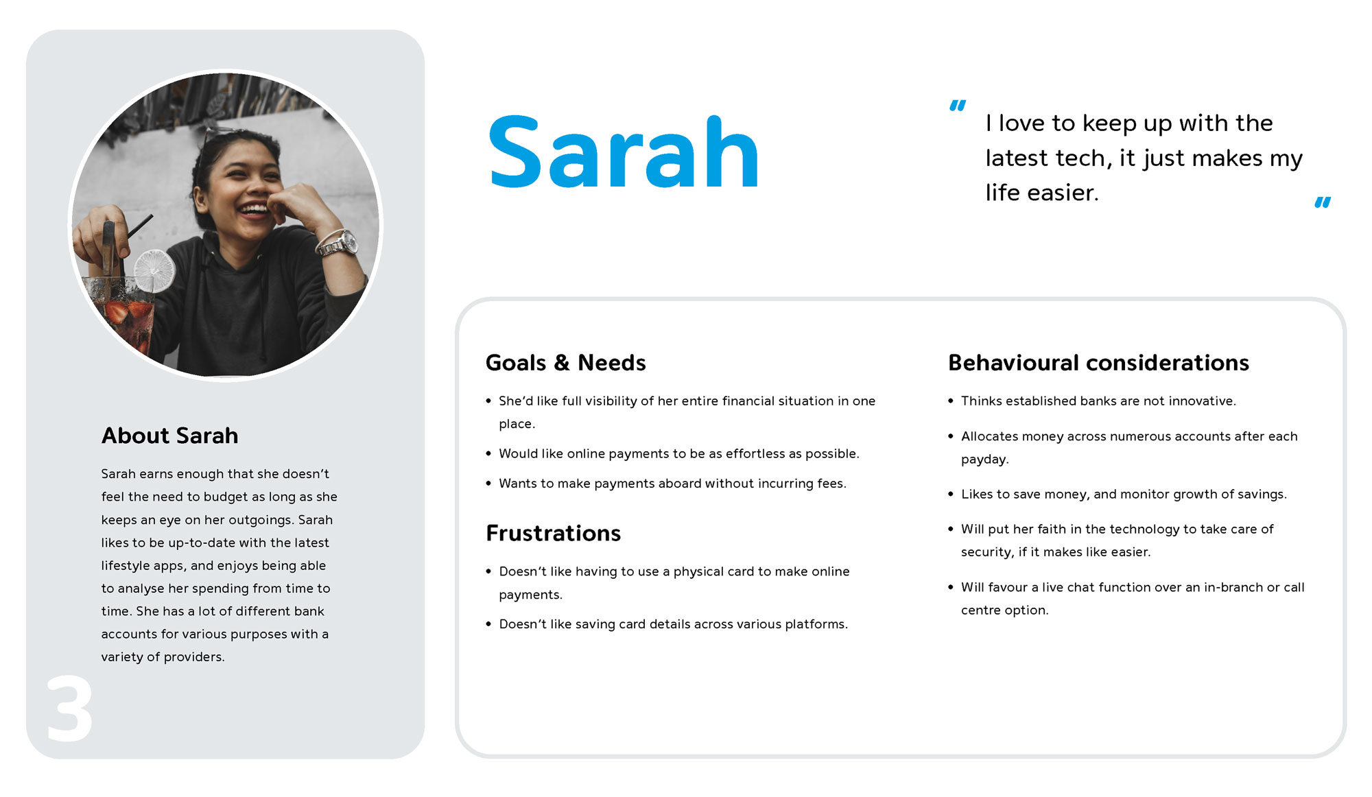
After analysing my results, I was able to created three user personas to represent typical PlutoPay users and their needs.
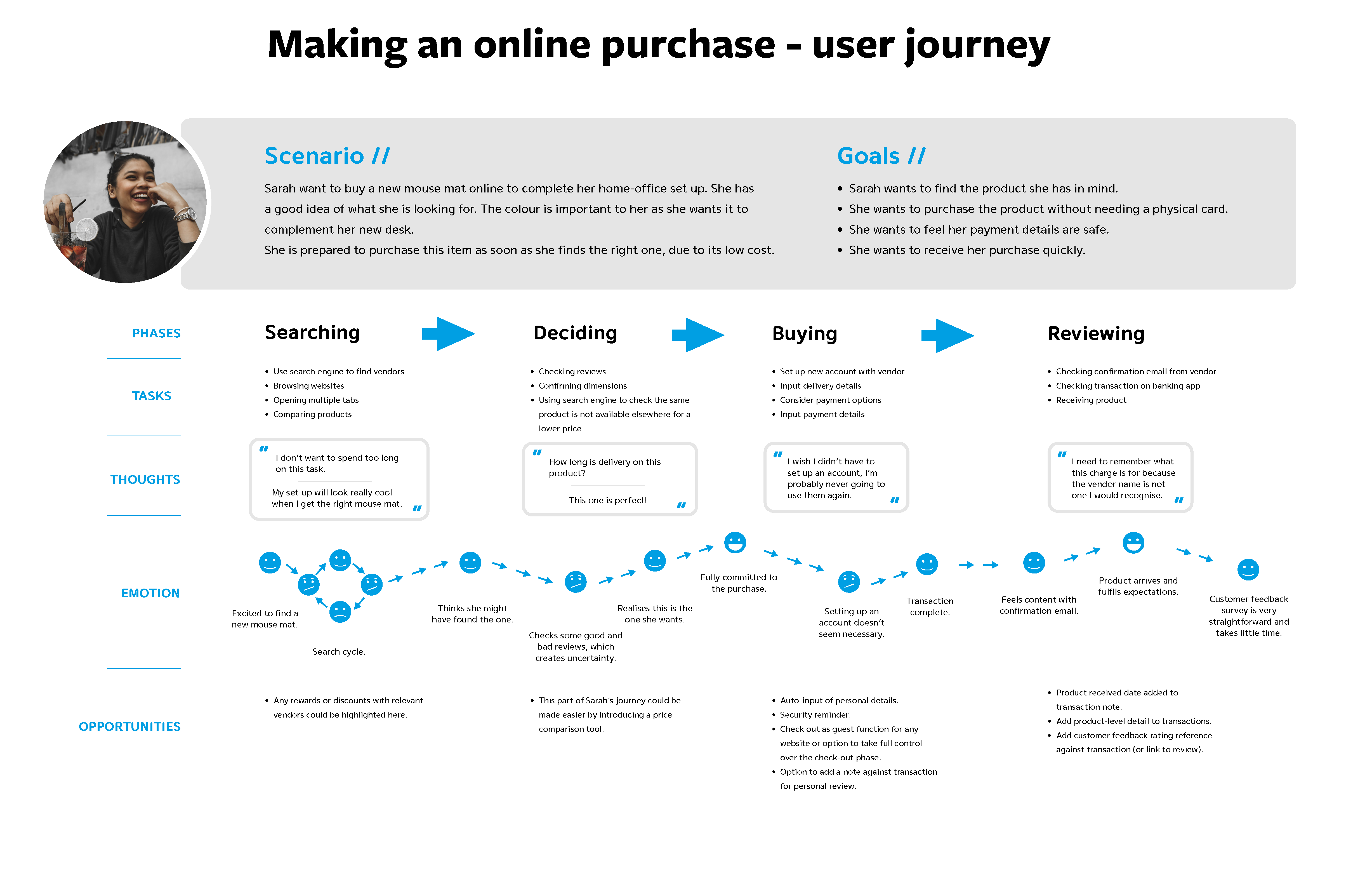
For each persona, I created a user journey relevant to their needs. Having established the pain points and opportunities in the user journey, I was able to create preliminary user flows as a blueprint for my design.
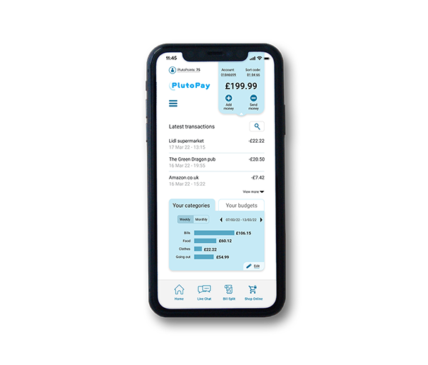
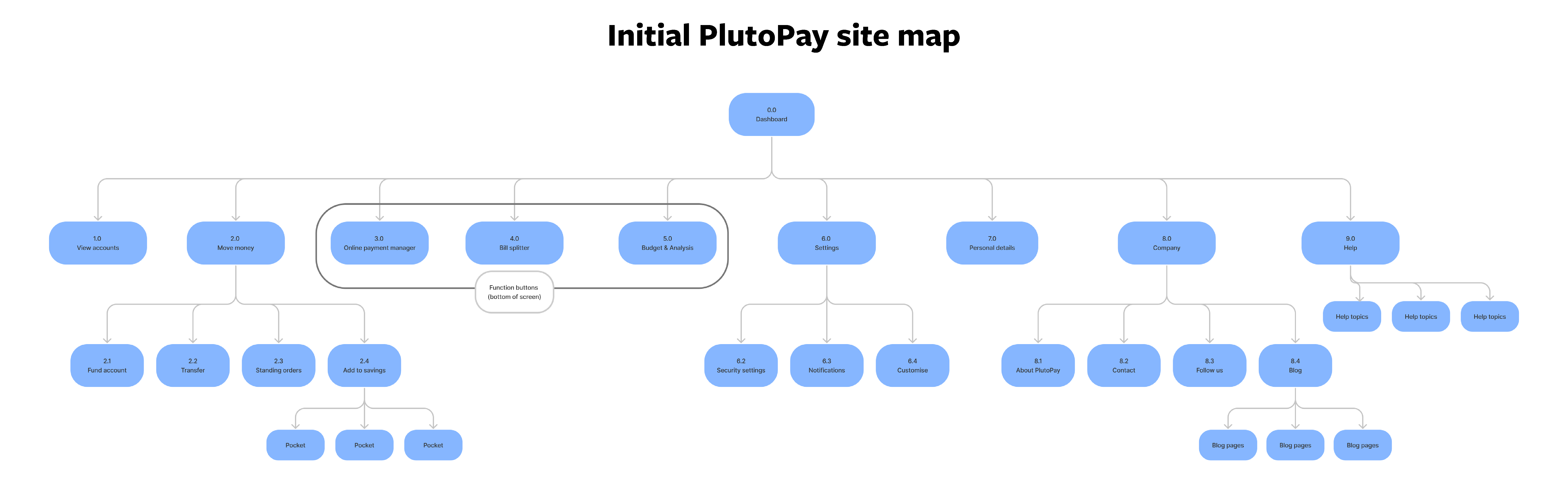
A site map for a minimum viable product helped with considerations regarding navigation. I qualified my decisions by conducting closed card sorting sessions. Rationale: My site structure is based on achieving a desirable MVP. My research showed that finance app users use their product to transfer money, despite a variety of other features on offer. Therefore, my first iteration will focus on core functionality and ease of use. Additional features can be implemented if/when user testing results reveal a need.
(press to enlarge)
Processing test results
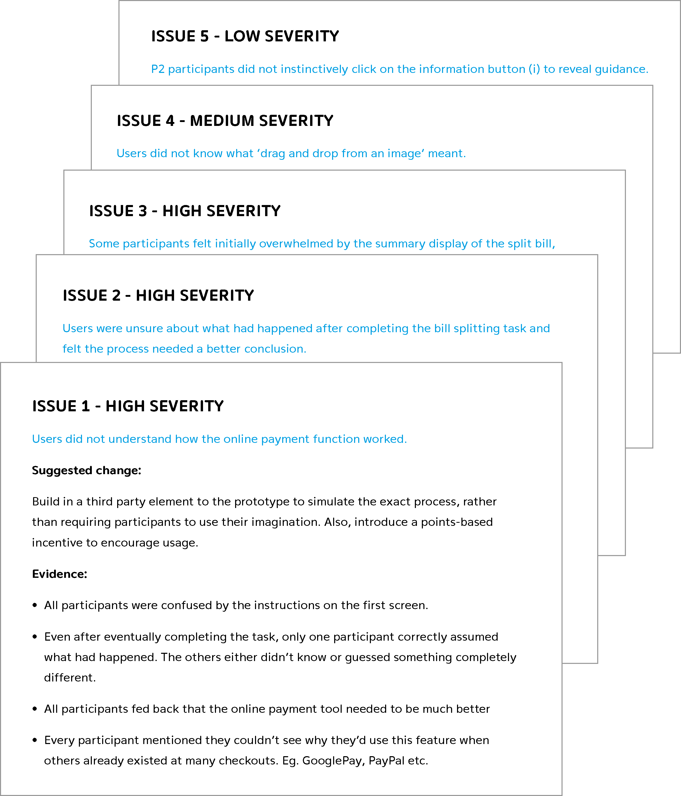
Usability test notes: In addition to video recordings, I tooked notes for each of the six sessions. These documents serve as useful for quick reference and reminders of the participant’s thoughts and feelings. Affinity map: I created an affinity map to help identify pain points and look for pattens in the group data. I used the video files of each session, making notes on participant errors, negative and positive quotes, and my own observations of their behaviour. Rainbow spreadsheet: Having collated all the user data, I completed a rainbow spreadsheet to clearly track and grade each potential issue. After reviewing these results, I was able to prioritise necessary changes/considerations for the next prototype iteration.
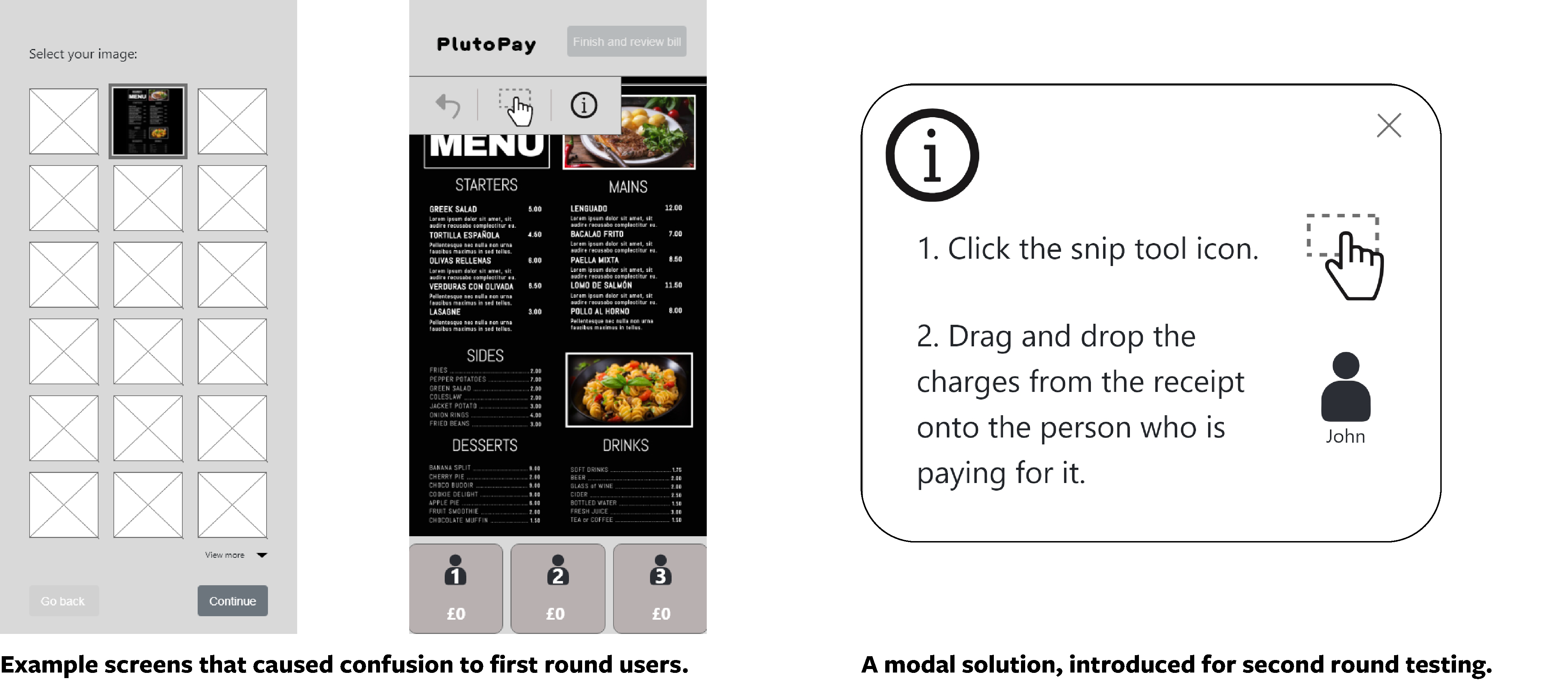
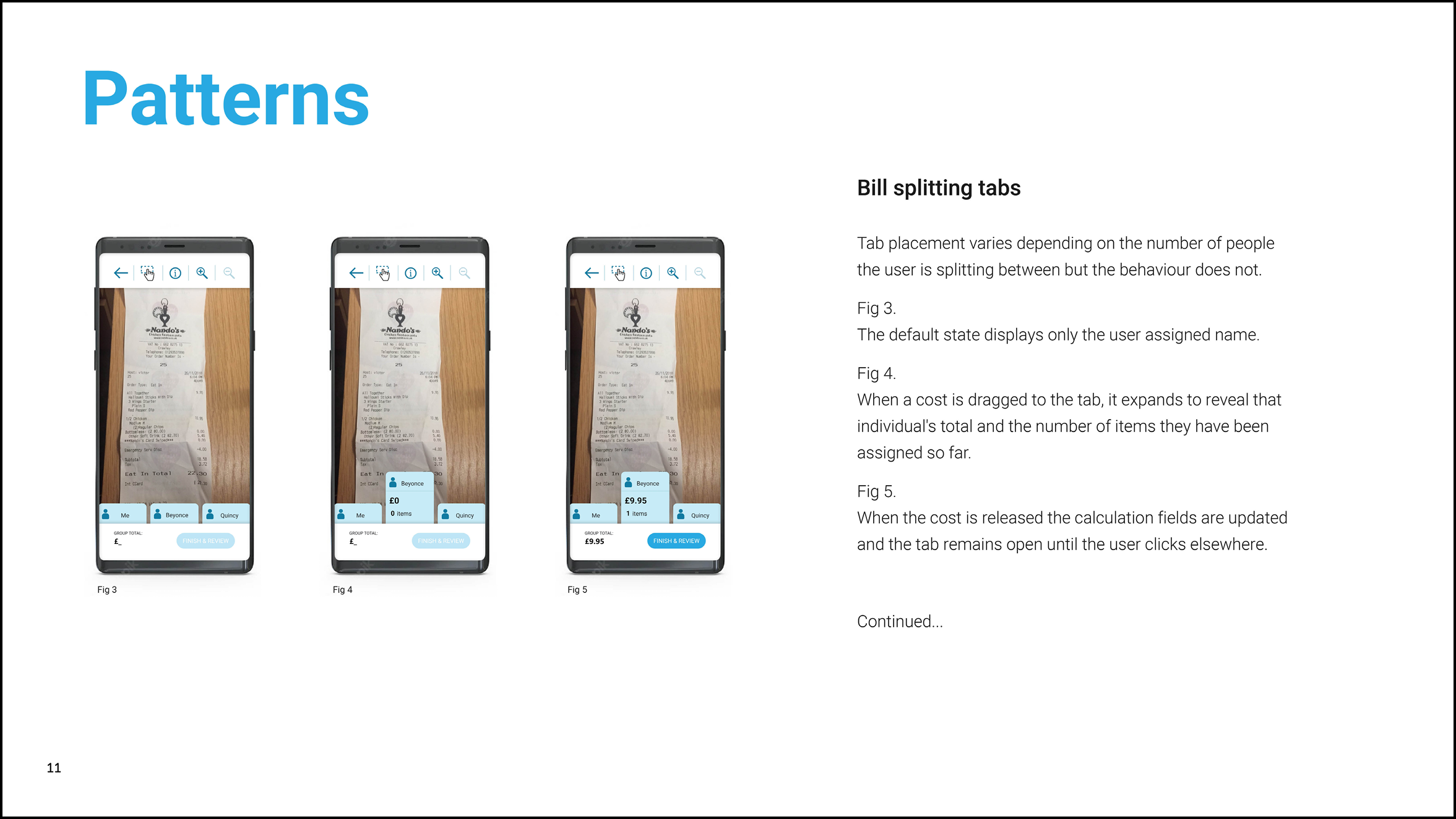
Addressing issues
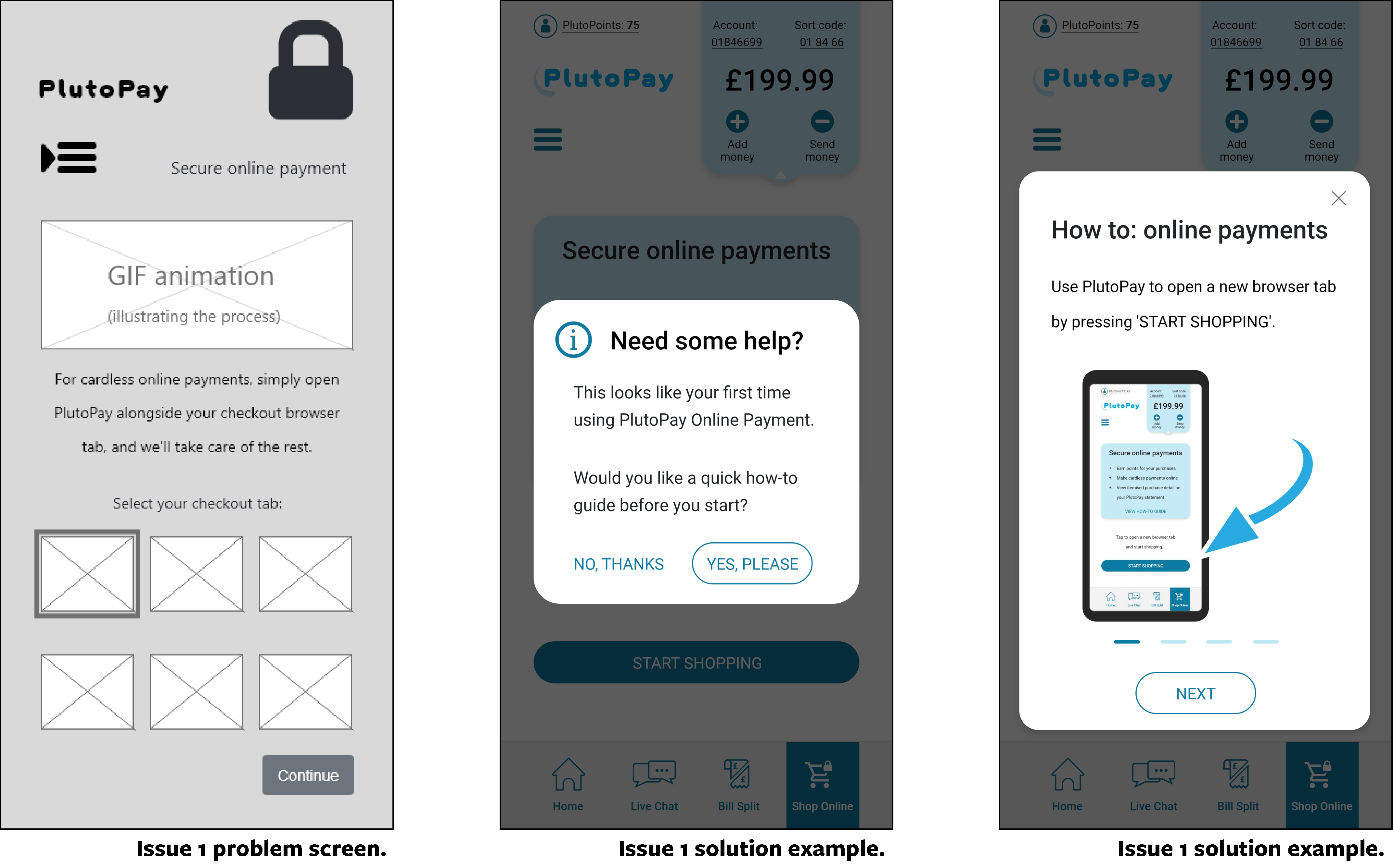
Having identified and ranked the five most important issues, I tackled the most serve issue first. In order to test how intuitive my idea was, I had supplied limited user guidence. After testing, it became evident that onboarding assistance would be necessary. My latest iteration features a dismissable four-screen how-to guide, with concise instructions and illustrations/animations.
Testing conclusions
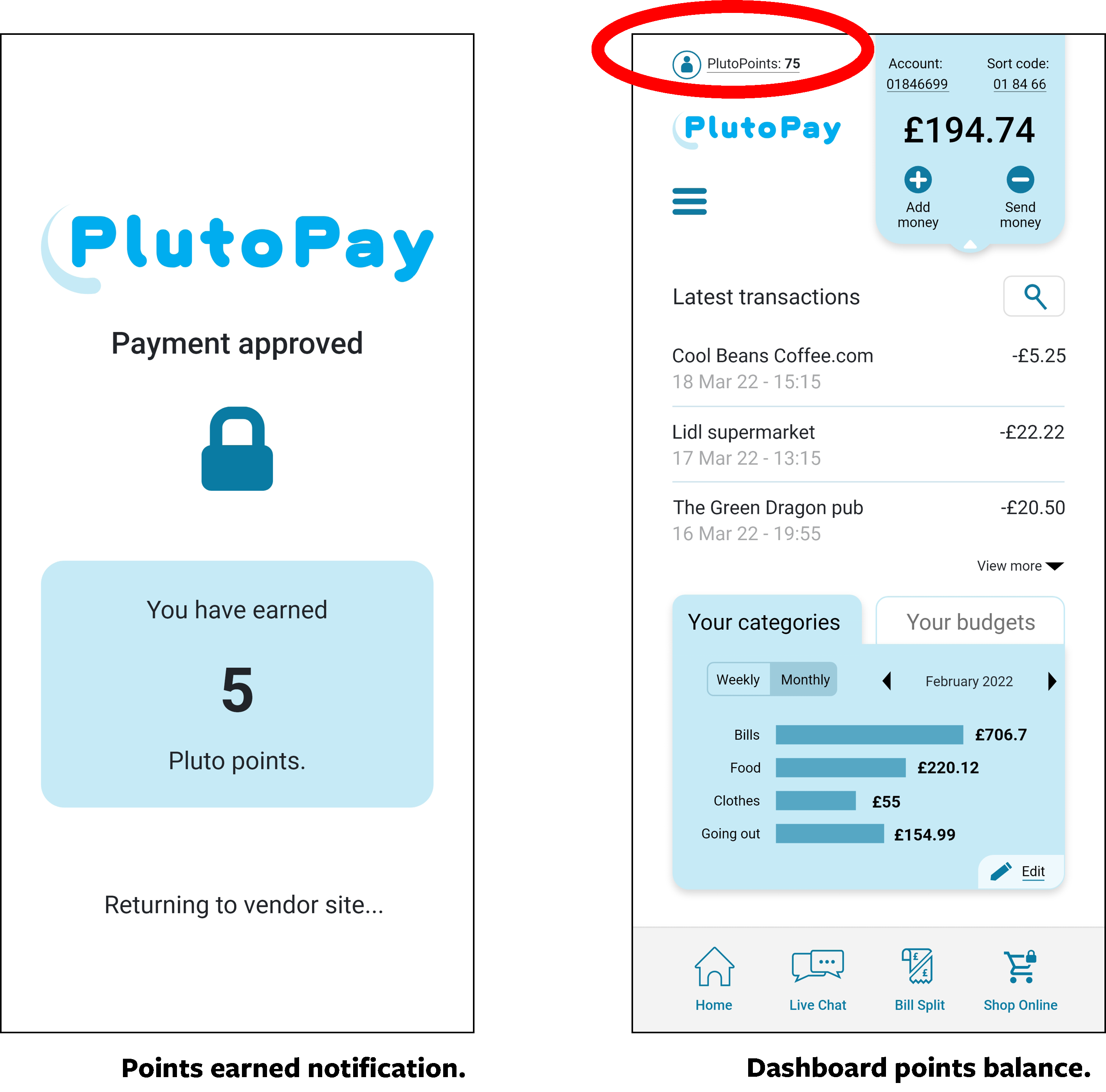
All participants liked the interface and felt it presented information in a clear and concise way. The analytics function, though not active in either prototype, was felt to be straightforward and deemed very useful. The most significant errors stemmed from a failure to understand the online payment function. All participants could, eventually, follow the intended flow but none understood what was happening. Most participants flagged that, while they liked the app, they didn’t see why they would use an online payment function when this problem is already solved by established products. All participants loved the idea of a bill splitting function, though first-round users found the process hard to follow. Second-round users did benefit from the addition of an info button, though it took them a while to press it. This was because they didn’t have any faith the button would reveal anything useful. I recommend further discussion with stakeholders regarding user incentive for the online payment tool. Every user claimed this was not a featured they saw value in, so an incentive (PlutoPoints) could be a solution worth exploring.
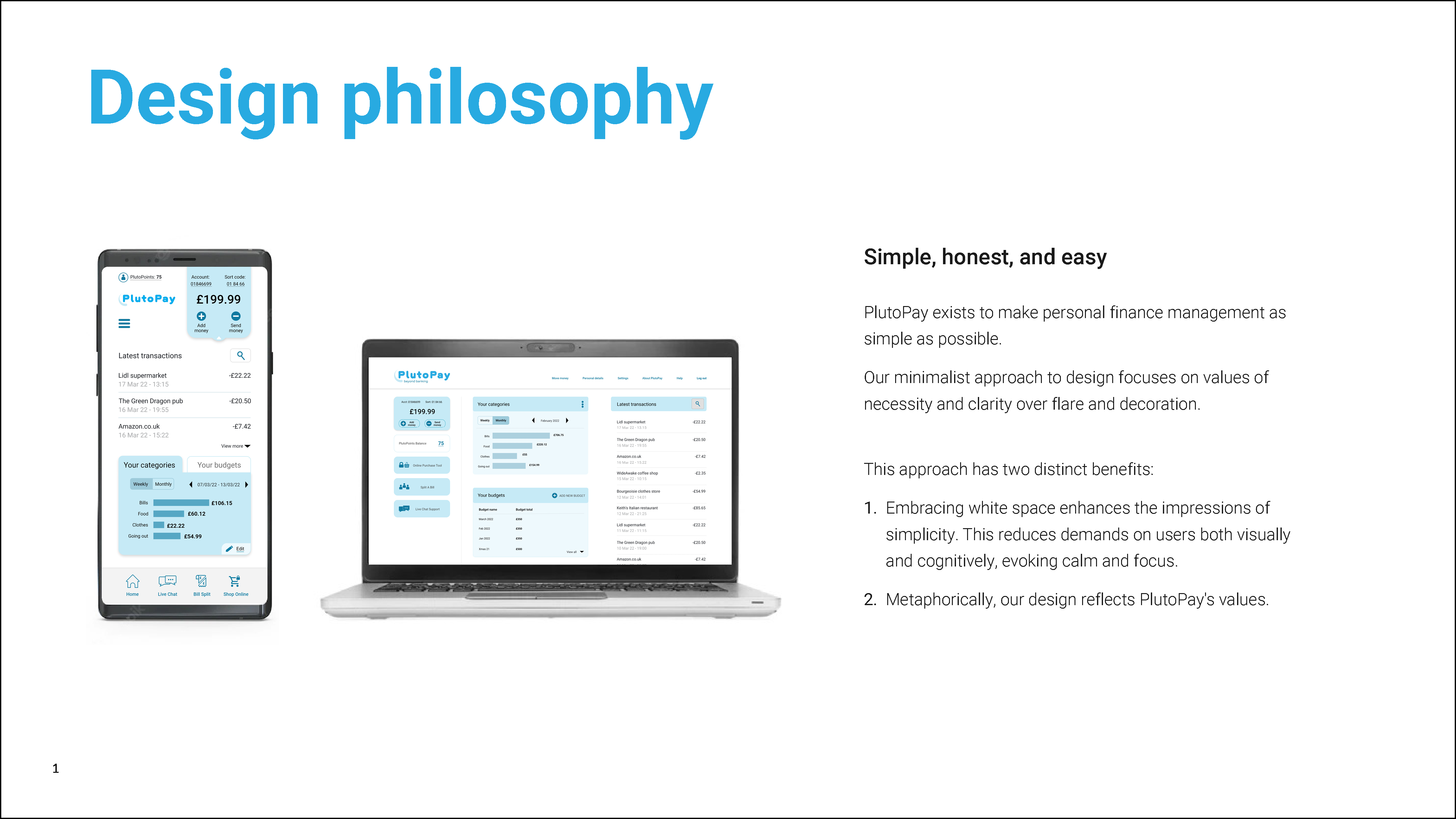
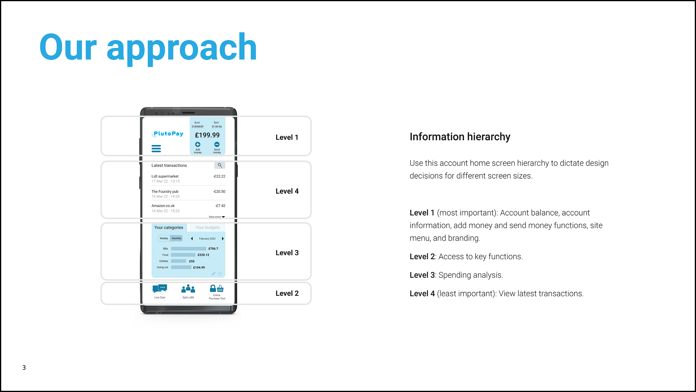
Design Language System
Steps: My completed Design Language System for this project contains guidance on the approach to design, composition details, design patterns, asset use, and content design. This language has developed throughout the duration of the project. Evolving from lo-fidelity wireframes to a polished high-fidelity prototype. Rationale: The Design Language System for this project has been based on design best practises such as Gestalt principles, grid layouts, and Material Design guidelines. I also created guidance for voice and tone to be applied to written content, designed to complement the visual aspects of the site evoking emotions of calm and trust in the user.